Label
The Label control is a content box to display text.
This documentation is a WIP and probably not exhaustive.
Usage Example
This example shows how to use the Label control with multiline text.
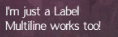
var exampleLabel = new Label()
{
      Text = "I'm just a Label\nMultiline works too!",
      Size = new Point(300, 100),
      Location = new Point(0, 0),
      Parent = parentPanel,
};
Available Parameters and Arguments
Size Type: Point Size of the control (optional)
Location Type: Point Position within parent panel
Parent Type: Panel Parent Panel
Text Type: String The text this control will show
Font Type: BitmapFont The used font (optional)
TextColor Type: Color Color of the font (optional)
WrapText Type: Bool Should text be wrapped when reaching the end of the control (optional)
ShowShadow Type: Bool 1px offset shadow will be applied behind the rendered text (optional)
ShadowColor Type: Color Color of the font (optional)
StrokeText Type: Bool A stroke effect will be applied to the text to make it more visible
AutoSizeWidth Type: Bool Match the width of the text
AutoSizeHeight Type: Bool Match the height of the text
Remarks
This documentation is a WIP and probably not exhaustive.